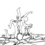
In the world of digital manga, the quality of your lines can make or break your design. Line weight—the variation in thickness of your strokes—is a fundamental tool that professional artists use to establish weight, focus, and depth in their work. Mastering this simple technique will instantly elevate the professionalism of your digital illustrations. Step 1: Thick Lines for Depth and WeightUse thicker, bolder lines for the outer silhouettes of your characters or where two shapes overlap. This technique helps separate the character from the background and creates a strong sense of volume. A thicker line suggests that a part of the body is closer to the viewer or carries more weight. Step 2: Fine Lines for DetailsReserve thin, delicate lines for internal details such as facial features, hair strands, or clothing folds. By keeping these lines light and precise, you prevent the drawing from becoming cluttered, allowing the viewer to focus on the character’s expression and anatomy. Step 3: Creating Flow with Tapered StrokesPractice tapering your lines—starting with a thicker stroke and ending with a light, thin flick. This mimics the natural flow of hand-drawn ink and adds a dynamic, organic feel to your artwork. Consistent practice with your tablet’s pressure sensitivity is the secret to achieving these smooth, professional transitions. ConclusionLine weight is not just about aesthetics; it is about guiding the viewer’s eyes through your story. As you refine your sketches, focus on where to thicken your lines to emphasize form and where to thin them to add detail. Keep drawing from your imagination and let your lines define your unique style!